
Overview
ITVX is the UK’s fastest-growing BVOD streaming platform, used by millions across Connected TV, Web, iOS, and Android.
I led the end-to-end redesign of the search experience across mobile and CTV—a critical journey influencing content discovery, engagement, and overall perception of the product.
Working closely with Product, Engineering, Data, and Marketing, we redefined search from a functional retrieval tool into a more intelligent discovery experience—better supporting both intent-driven and exploratory viewing behaviours.
This shift delivered a 25% increase in search-driven viewing and a 15% reduction in abandonment, strengthening both immediate engagement and long-term retention.
Reframing Search as a Discovery Opportunity
Search is one of the most critical entry points in ITVX — ranked the third most visited page, behind only the homepage and programme pages — yet it was underperforming as a discovery surface.
The experience was built around narrow, intent-led behaviour: users arrived with a specific title in mind, completed their task, and left. This created a dead-end journey, with little encouragement to continue exploring or engage with additional content.
At the same time, perception of ITV’s content breadth was significantly low, ranking behind competitors like Channel 4. This was a key strategic issue—because when users were actually exposed to the full catalogue, ITV ranked much higher in terms of relevance and appeal. The problem wasn’t the content—it was how little of it users were able to see.
The existing search experience compounded this gap. Limited functionality and an outdated interface reinforced the idea of a small catalogue and restricted our ability to surface relevant, diverse, or unexpected content.
This created a clear opportunity:
To evolve search from a utility for retrieval into a discovery engine—one that not only helps users find what they came for, but also reveals the true breadth of ITV’s content and keeps them engaged beyond a single interaction.
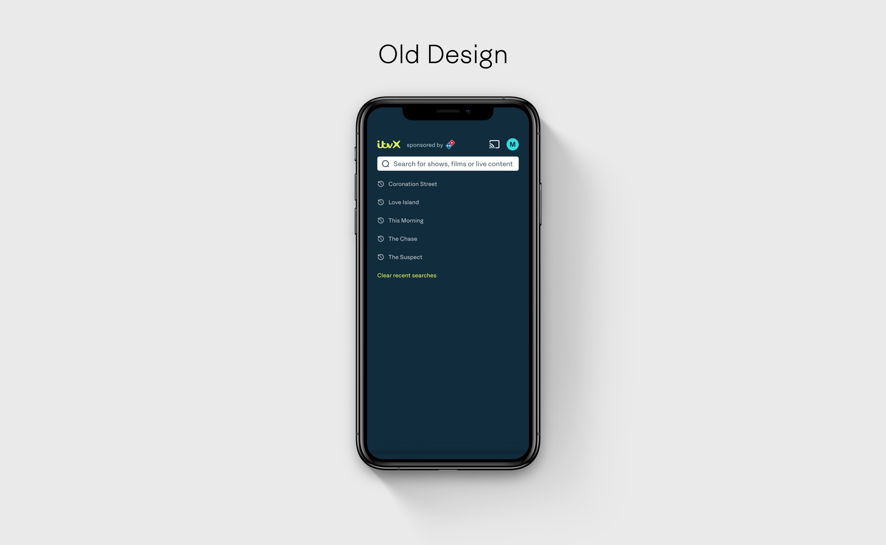
A look at the old design 👀
Understanding the Gaps in the Experience
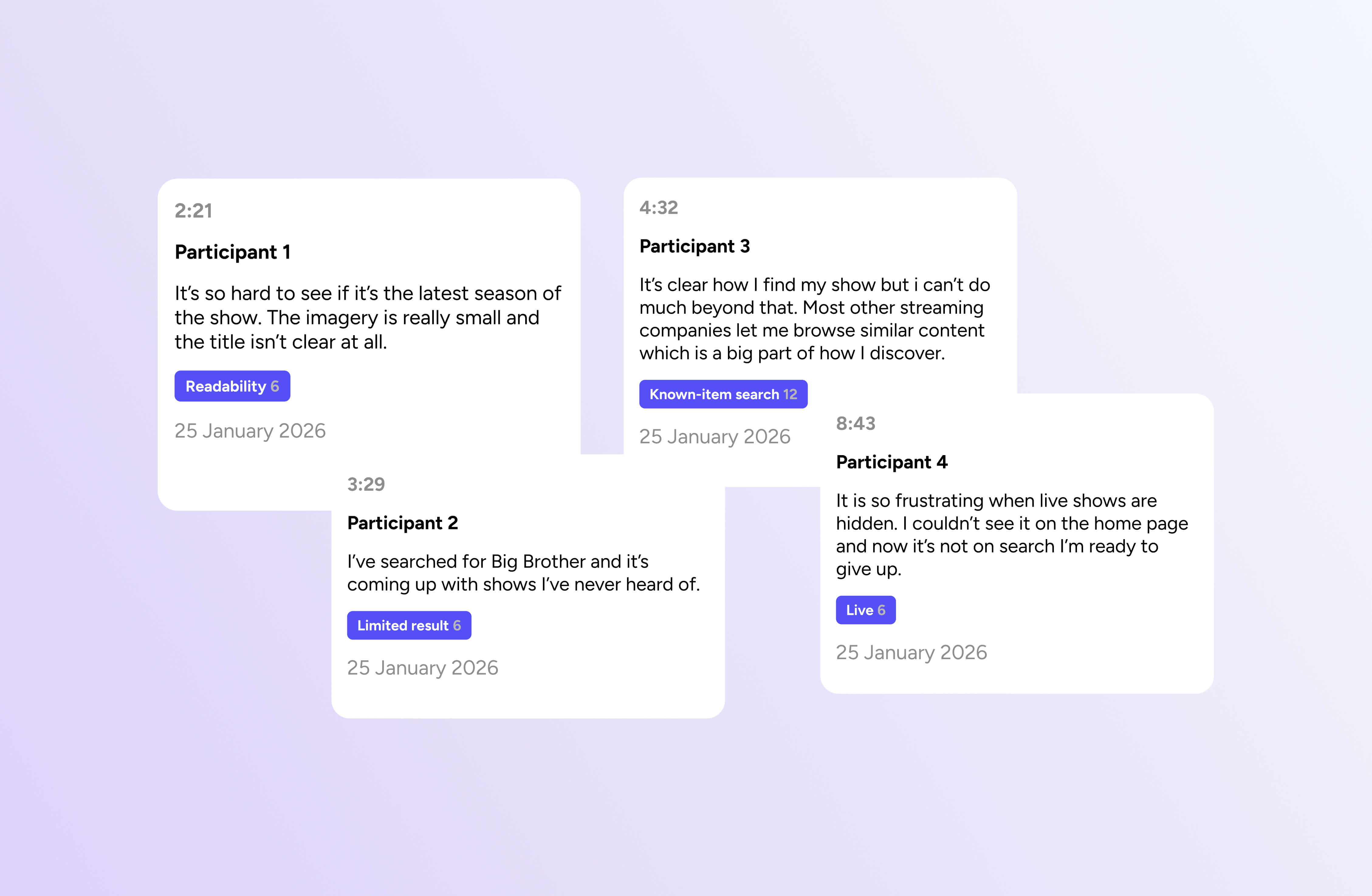
To understand what was holding search back, we combined quantitative data with qualitative insight—analysing behavioural patterns alongside usability testing, surveys, and in-depth user interviews.
This allowed us to move beyond surface-level issues and identify three core experience gaps:
Inconsistent and limited results
Search results were often narrow and unreliable, failing to surface relevant or popular content. This was particularly problematic in high-intent moments — such as live events — where delays in finding the right content led to frustration and drop-off.Poor readability and scanability
The two-column layout made it difficult for users to quickly interpret results. Users were forced to do the cognitive work of identifying the right content, especially when titles were similar (e.g. Love Island vs Love Island: After Party). This friction disproportionately impacted lapsed users, who lacked the context to navigate efficiently.No support for exploratory behaviour
Search was designed purely for retrieval, with no capability to browse by genre, mood, or theme. This limited its role within the product, preventing it from supporting discovery, inspiration, or deeper engagement.
Shifting from Retrieval to Discovery
The research insights led to a clear shift in how search should function—guided by three principles: from intent to understanding, from friction to clarity, and from retrieval to discovery.
From intent → understanding
Search needed to move beyond exact-match queries to better interpret what users actually meant. We introduced semantic search to handle broader and more natural inputs, enabled search by actor, and incorporated popularity signals to surface relevant and trending content. This ensured users could reliably find what they were looking for —even when their input was incomplete or ambiguous.
From friction → clarity
The existing experience placed too much cognitive load on users. We simplified the interface by moving to a single-column layout, improving scanability and flow. Alongside this, we refined imagery and editorial copy to better communicate content value—helping users make faster, more confident decisions.
From retrieval → discovery
We redefined search as a space for exploration, not just task completion. By introducing curated collections across films and shows, users could browse by theme, mood, or context. The experience was intentionally designed so that within just a couple of interactions, users could uncover the true breadth of the catalogue—encouraging continued engagement beyond their initial intent.
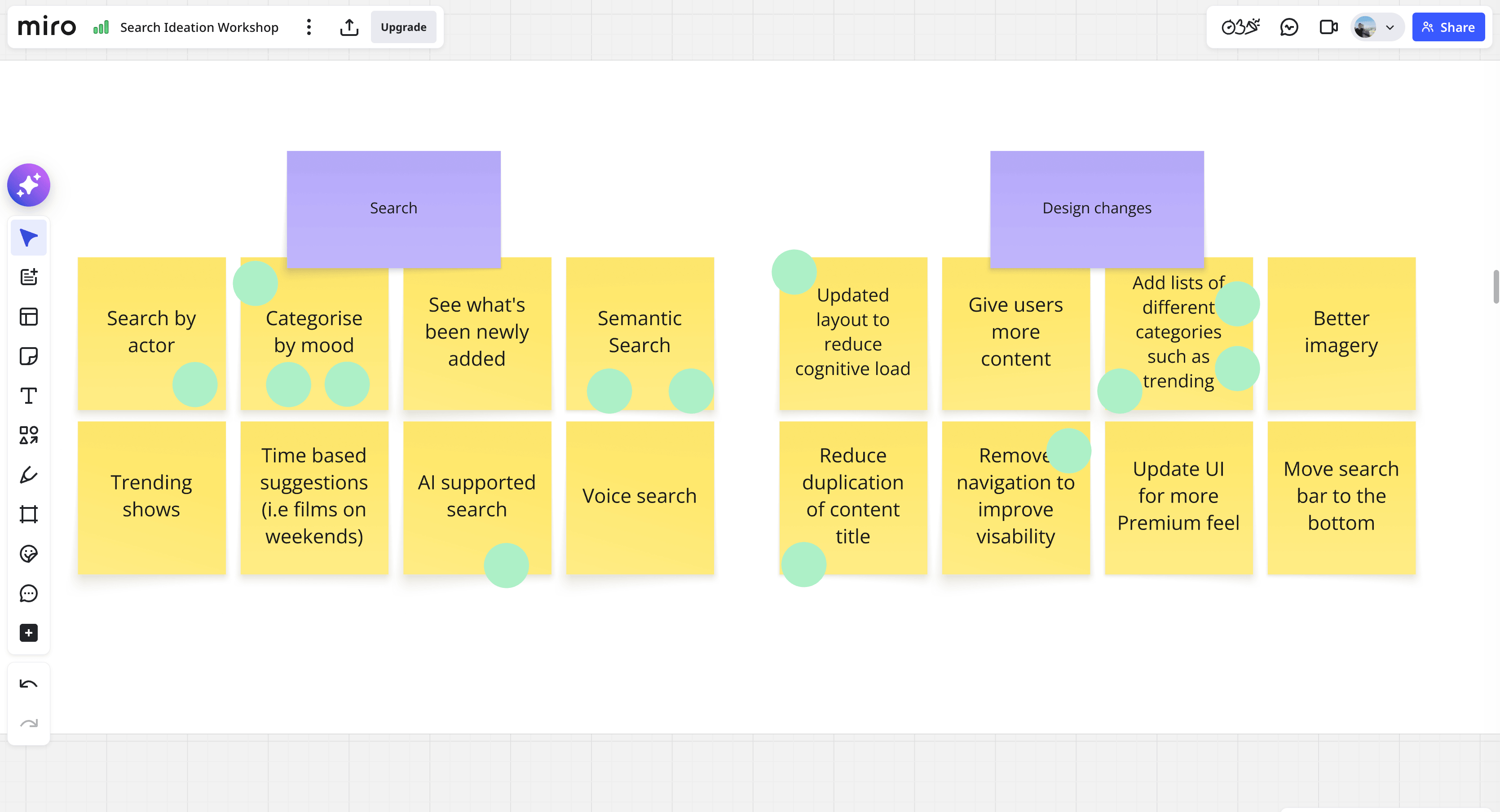
[I facilitated an ideation workshop with PM, Engineering & marketing to kickstart ideation.]
Designing a More Intelligent Search Experience
We redesigned search as a unified experience that balances precision with discovery—helping users quickly find what they came for, while making it easier to explore and engage with more of the catalogue.
A more discoverable search surface
To better showcase the breadth of content, we introduced tabbed collections featuring new and trending titles—such as Top 10 Comedy and Unmissable Boxsets. These curated entry points created low-effort ways for users to browse, shifting search from a single-purpose tool into a richer discovery surface.
Clearer focus and improved usability
We increased the prominence of the search bar, making it easier to find and interact with. At the same time, we removed both top and bottom navigation to reduce distraction and maximise the amount of content visible on screen—keeping users focused on results and exploration.
Designed for fast scanning
The previous two-column layout was replaced with a single-column structure, significantly improving readability and flow. This allowed users to process results more quickly and confidently, especially when comparing similar titles.
Richer, more actionable results
We evolved the results card into a more informative and interactive unit. Each result now includes video previews (trailers), the ability to save content to a list, and enhanced metadata to provide more context at a glance—helping users make quicker, better-informed decisions without needing to navigate away.
The new search page ✨
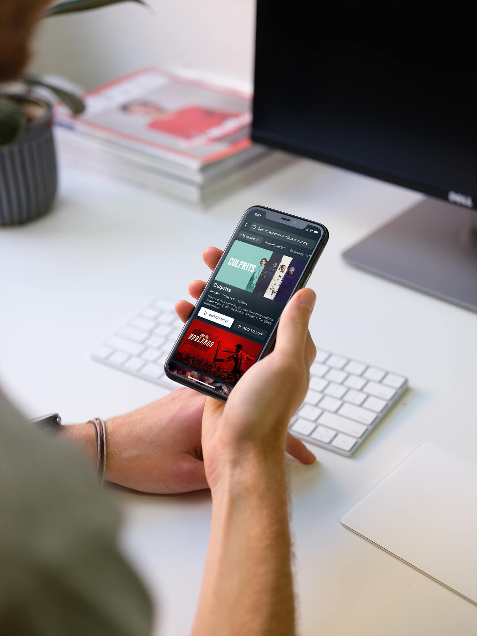
The redesigned experience balances intent-driven search with lightweight discovery—encouraging users to keep exploring even when they don’t know exactly what they want.
Driving Measurable Impact
The redesigned search experience delivered significant results within the first six weeks of launch:
+25% increase in search-driven viewing, driven by improved relevance and stronger discovery pathways
–15% decrease in abandonment, as users were able to find and decide on content more quickly
+20 million increase in hours watched, contributing directly to overall engagement across the platform
Beyond the metrics, the impact extended across the wider product ecosystem. By transforming search into a reliable discovery surface, we improved content visibility, reduced reliance on other recommendation touchpoints, and created more opportunities for users to re-engage with ITVX.
Search evolved from a functional tool into a key driver of engagement and retention at scale—better reflecting the true breadth and value of the catalogue.
Reflection
This work reinforced the importance of designing beyond the immediate task. By reframing search from a tool for retrieval into a space for discovery, we were able to unlock significantly more value—for both users and the business—without increasing complexity.

